Spotify’s Disco Ball Icon: A Brief Festive Interlude Before the Classic Green Returns
- Spotify replaced its iconic green logo with a festive disco ball to commemorate its 20th anniversary.
- The company has confirmed that the change is temporary and the original branding will return by the end of the week.
- The move has sparked discussions regarding the need for better native app icon customization options to balance brand marketing with user aesthetic preferences.
The End of the Disco Era: Spotify Reverting to Iconic Branding
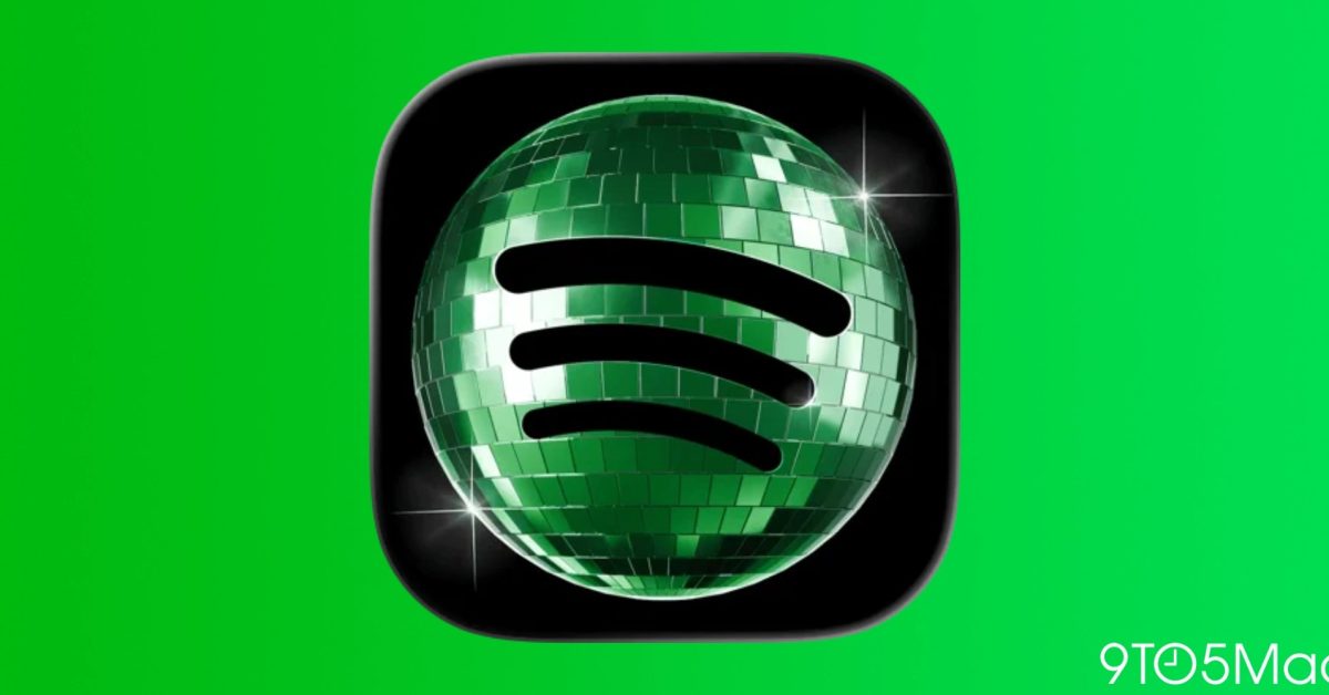
For the past few days, smartphone users opening their home screens have been greeted by a shimmering, photorealistic disco ball instead of the familiar, minimalist green Spotify logo. The change, which sparked a flurry of reactions across social media, was intended as a celebratory nod to Spotify’s 20th anniversary. However, the company has officially confirmed that this glittery transformation is merely a temporary birthday tribute.
Why the Change Caused a Stir
In the world of UI/UX design, app icons are more than just shortcuts; they are essential anchors for user navigation. The abrupt switch to a complex, high-contrast, and textured disco ball design disrupted the visual consistency of many users’ carefully curated home screens. This led to a wave of feedback from the community, ranging from aesthetic concerns to confusion over whether the change was permanent.
Spotify addressed these concerns directly on social media, assuring users: “Alright, we know glitter is not for everyone. Our temp glow up ends soon. Your regularly scheduled Spotify icon returns next week.”
The Debate Over ‘App Icon Customization’
The incident highlights a broader tension between brand experimentation and user personalization. While many platforms—notably Instagram—have experimented with temporary icon swaps in the past, there is a growing call from the tech community for more robust, native app icon support. Advanced users often prefer the ability to select from a suite of alternative icons that align with their personal home screen aesthetic, rather than having a temporary design forced upon them.
Looking Ahead: Embracing Dynamic Branding
While the disco ball may have been divisive, it underscores a successful, if brief, marketing campaign that successfully highlighted the company’s two-decade milestone. As Spotify prepares to revert to its standard, iconic green circular logo, it serves as a reminder of how digital brands can leverage small UI changes to drive massive engagement. The “party” will conclude later this week, and for those who prefer the classic, clean look, the wait for the familiar green icon is nearly over.
For developers and brand managers, this serves as a case study: while creative refreshes are an excellent way to celebrate corporate milestones, they are best received when users are given a choice in how their digital environment looks.