iOS 27 Leaks: Is Apple Finally Fixing the ‘Liquid Glass’ Navigation Woes?
- iOS 27 is expected to introduce major design refinements, including a overhaul of system-wide tab bars and new UI animations.
- The update will likely address common user complaints regarding 'Liquid Glass' by reintegrating search functions into tab bars and reducing unnecessary tap counts.
- Apple is reportedly shifting away from the collapsing tab bar behavior, opting for a more consistent and accessible navigation structure across core applications.
Revolutionizing the User Experience: What iOS 27 Promises
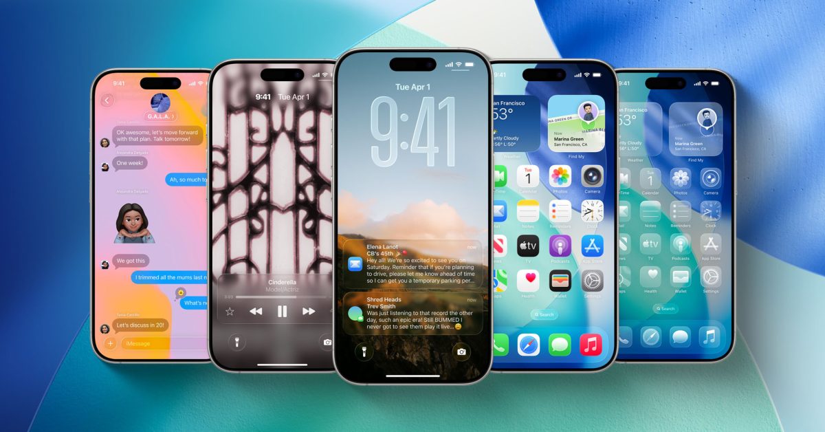
As the tech community braces for the upcoming unveiling of iOS 27, anticipation is reaching a fever pitch. Recent reports from Bloomberg’s Mark Gurman have shed light on significant design refinements that could fundamentally alter how users interact with their iPhones. Among the most anticipated updates are systemic changes to the ‘Liquid Glass’ aesthetic, specifically targeting the controversial tab bar behavior that has frustrated power users since the introduction of iOS 26.
Redesigning System Navigation
At the heart of the rumored design refresh is a return to more intuitive interface patterns. Gurman notes that Apple is planning a comprehensive overhaul of tab bars across several native applications. The most noteworthy change involves merging the search functionality back into the primary tab bar, a move that suggests Apple is pivoting away from the fragmented navigation experience introduced in previous versions.
In addition to these structural changes, iOS 27 is expected to debut new system-wide animations. One standout feature rumored to be in the works is a sophisticated keyboard animation where the keys slide elegantly from the bottom of the interface, potentially replacing the static appearance of current versions and offering a smoother tactile visual response.
Addressing the ‘Liquid Glass’ Regression
For many users, the ‘Liquid Glass’ design language—while visually stunning—introduced a major usability bottleneck: the collapsing tab bar. In iOS 26, these bars often shrink into a single, unobtrusive icon when scrolling, forcing users to perform additional taps to navigate between sections. For core apps like Music, Photos, and Podcasts, this extra step has been widely criticized as a regression in productivity.
The upcoming integration of search directly into the tab bar serves as a strong indicator that Apple may be abandoning the auto-collapsing feature altogether. By reintegrating these navigation elements, Apple appears to be prioritizing ease of access over minimalist aesthetics. If these leaks hold true, it signifies a victory for user feedback, proving that Apple is willing to iterate on its design language to restore functionality.
What This Means for the Future of iOS
While the leaked details are currently focused on UI refinements, they point toward a broader strategy of balancing modern design with efficient utility. The move to standardize tab bar behavior across apps—likely ensuring that essential navigation remains visible regardless of scroll status—will significantly improve the daily experience for iPhone users. As we await the official launch, the message from Cupertino seems clear: the era of sacrificing utility for the sake of experimental design may finally be coming to an end in favor of a more cohesive, user-centric environment.