Spotify’s Disco Ball Icon: A Temporary Celebration of 20 Years of Streaming
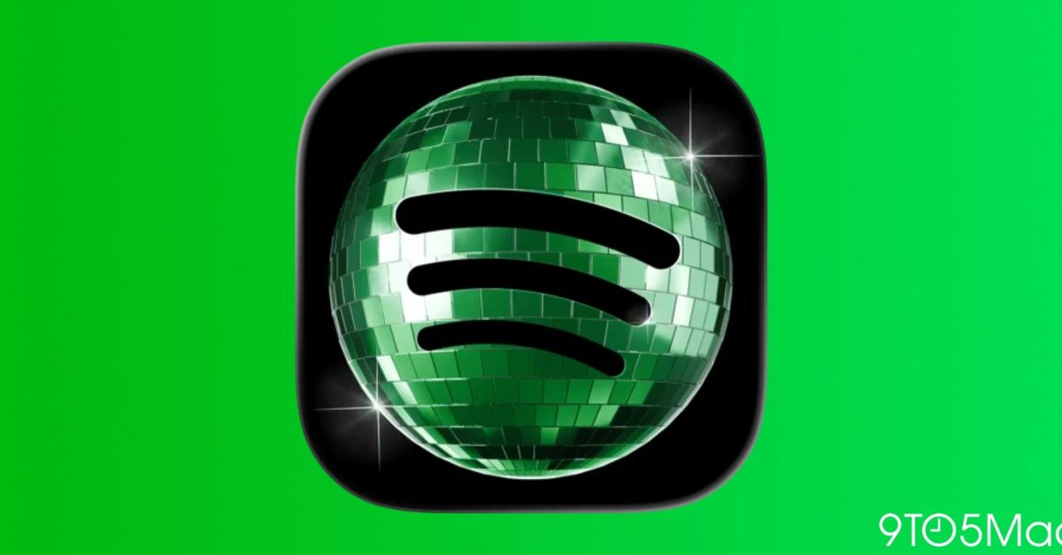
- Spotify replaced its iconic green logo with a disco ball to celebrate the company's 20th anniversary.
- The change was intended to be a temporary, fun promotional move rather than a permanent rebrand.
- Due to mixed user feedback regarding home screen aesthetics, Spotify is reverting to the original icon later this week.
Spotify Bids Farewell to the Disco Ball Icon
For the past few days, millions of mobile users were greeted by a shiny, photorealistic disco ball instead of the iconic flat-green logo they have become accustomed to. This sudden aesthetic shift, which appeared on both iOS and Android platforms, was Spotify’s way of commemorating its 20th anniversary. However, as the streaming giant has confirmed, the party is coming to an end, and the classic branding will soon be restored.
The Reason Behind the Refresh
While the change caught many users off guard, it was a deliberate design choice meant to celebrate two decades of music streaming. The disco ball, a universal symbol of dance and celebration, was chosen to reflect the platform’s long-standing connection to music culture. Despite the whimsical intent, the reaction from the user base was notably polarized.
Why Users Reacted Strongly
In the world of mobile UI and UX, consistency is paramount. Users often curate their home screens with specific color palettes and icon styles. A sudden, drastic change—especially one that disrupts the visual flow of a home screen—can be jarring for those who value aesthetic uniformity. As social media discourse proved, the sudden “discomorphism” of the Spotify icon left many users eager for a return to the minimalist green standard.
Addressing the Feedback
Responding to the influx of feedback on platforms like X (formerly Twitter), Spotify clarified that the “glow up” was strictly a limited-time engagement. The company confirmed that the disco ball would be sunsetting, with the original logo set to return to app stores globally by the end of the week.
The Future of Custom App Icons
The situation highlights a broader discussion within the tech community regarding app customization. While some users appreciate the fun, experimental nature of temporary icons, many would prefer if companies adopted a more modular approach. Following in the footsteps of previous campaigns by Instagram, there is a clear demand for features that allow users to choose their own app icons, rather than having temporary changes forced upon them as the default.
Ultimately, while the disco ball may have been a divisive marketing tactic, it stands as a reminder of how deeply integrated these apps are into our daily digital lives. Whether you loved the glitter or couldn’t wait to get back to the classic green, Spotify has listened, and normalcy is just a software update away.